React 设计模式~布局组件~
- 屏幕分割器
这种模式经常用于由侧边栏、主栏等组成的常见布局。
・app.js
import { splitscreen } from "./components/split-screen";
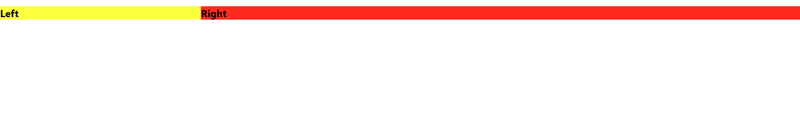
const leftside = ({ title }) => {
return <h2 style="{{" backgroundcolor:>{title}</h2>;
};
const rightside = ({ title }) => {
return <h2 style="{{" backgroundcolor:>{title}</h2>;
};
function app() {
return (
<splitscreen leftwidth="{1}" rightwidth="{3}"><leftside title='{"left"}'></leftside><rightside title='{"right"}'></rightside></splitscreen>
);
}
export default app;
・该组件将 splitscreen 组件中的 leftside 和 rightside 组件作为子组件包装。
・我将标题道具传递给 leftside 和 rightside 组件。
·我将 leftwidth 和 rightwidth 属性传递给 splitscreen 组件,以便我可以更改每个组件的宽度。
・split-screen.js
import React from "react";
import { styled } from "styled-components";

const Container = styled.div`
  display: flex;
`;

const Panel = styled.div`
  flex: ${(p) => p.flex};
`;
export const SplitScreen = ({ children, leftWidth = 1, rightWidth = 1 }) => {
  const [left, right] = children;
  return (
    <container><panel flex="{leftWidth}">{left}</panel><panel flex="{rightWidth}">{right}</panel></container>
  );
};
・该组件由左组件和右组件组成,它们作为子组件接收。
・我可以将接收 props 的每个组件的宽度更改为 leftwidth 和 rightwidth。
以上就是React 设计模式~布局组件~的详细内容,更多请关注www.sxiaw.com其它相关文章!